Commemorating 50 Years of the Gateway Arch and St. Louis Blues through Design | 5BYFIVE Creative
Our client, CityArchRiver Foundation, was in charge of a very important task: renovating St. Louis’ most important landmark, the Gateway Arch. In order to celebrate the Arch's new surroundings, the landmark's stewards organized Winterfest at the Arch in conjunction with the St. Louis Blues hosting the NHL’s Winter Classic.
Because the celebration included the classic yuletide tradition of an outdoor skating rink in the shadow of the Arch’s striking midcentury modern aesthetics, it was our job to create branding, including a logo and visual assets, that reflected these two classic River City institutions while keeping an eye towards the future.
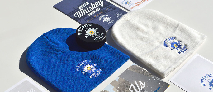
In order to bring warmth to the visual style, we took cues from family – it doesn’t get much warmer than that – and that welcoming feeling that you just can’t get from off-the-shelf imagery. By combining the iconic St. Louis skyline, highlighted by the Arch and the Old Courthouse, with vintage design cues from a bygone era when the family would pile into the station wagon and head to the skating rink, we found the sweet spot for Winterfest at the Arch’s brand.
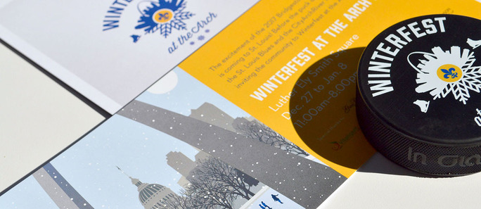
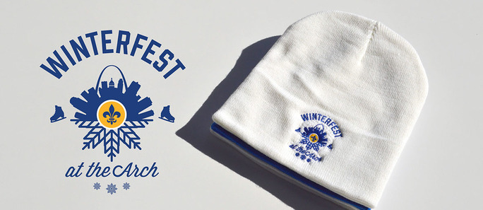
It began with the logo, with the city skyline taking the shape of a snowflake, highlighted by the Blues' team colors and flanked by a pair of ice skates. Since the event played to the modernistic retro trends that have become imbued with pop culture, we wanted something that would look at home on a letter jacket or a vintage hockey sweater. This informed the illustration, created by Arsenal Handcraft, to look equally as inviting for modern-day St. Louisans or those from 50 years ago, when the Arch first was erected and the Blues dropped the puck for their inaugural season. Throughout the illustration, the color scheme drew together the steel gray of the Arch with the blues and yellows of the Blues.
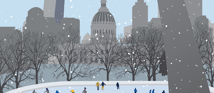
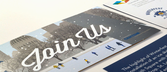
This timeless illustration, using figures with vaguely drawn features that allowed the viewers to imagine themselves as the ice skaters underneath the Arch, taking one more lap before joining the rest of the family for hot chocolate and roasted chestnuts. We employed this illustrative style either directly, with invitations, postcards and multi-fold mailers using this visual style to tell the story of Winterfest, or indirectly, as seen on the Winterfest website.
From the video showing just skates gliding across the rink to deceptively plaintive illustrations, the website drew the viewers in and piqued their curiosity so they would explore the entire slate of Winterfest activities. This inaugural event held boundless possibilities, and instead of overexplaining or using misrepresentative stock photography, we let simplicity and clean design inspire visitors to dream of what could be.
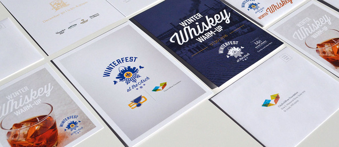
Additionally, the Winter Whiskey Warm Up was a fundraising event tied into the festival. Taking place in the regal and historic surroundings within the Old Courthouse’s rotunda, we married a classic style bordering on old-fashioned with the overall Winterfest brand when creating the invitations for the event. The whiskey barrels recalled a historic time before prohibition came along when whiskey would arrive on a steamboat mere blocks away from the Old Courthouse. As the invitation unfolded, the marriage of clean, modern design and classic styling told the story and gave the event the resplendent nature that it deserved.
As proud St. Louisans, we put the passion that we have for our city and our beloved hockey team into this project for the CityArchRiver. Because of their work, we are excited for 50 more years of the Gateway Arch, which now enjoys surroundings that are worthy of this world-renowned icon.
