Cleansing the Creative Palette: Why Breaking Routine Sparks Better Ideas | 5BYFIVE Creative
Creativity is like a muscle—it thrives on challenge, movement, and sometimes, a little disruption. In the world of design and branding, it’s easy to get comfortable, to rely on familiar styles, trusted formulas, and well-worn creative instincts. But the moment we stop pushing boundaries, we risk falling into patterns that feel safe but not necessarily inspired.
That’s why cleansing the creative palette is essential. It’s about resetting, refreshing, and stepping outside the expected to see things from a new perspective.
The Power of Creative Disruption
Creativity isn’t just about making things look good—it’s about making people feel something, think differently, or experience an idea in a new way. And yet, when we’re working within brand guidelines, campaign objectives, and audience expectations, we can start to unconsciously color within the lines.
Disrupting that routine forces us to rethink the way we approach creative work. It’s why our design team is diving into an exercise that reimagines movie posters to better reflect their personal take – outside of any guidelines or requirements.
These kinds of challenges force us to break from our usual patterns, rethink visual storytelling, and explore design choices that may be unexpected—but also, potentially, brilliant.

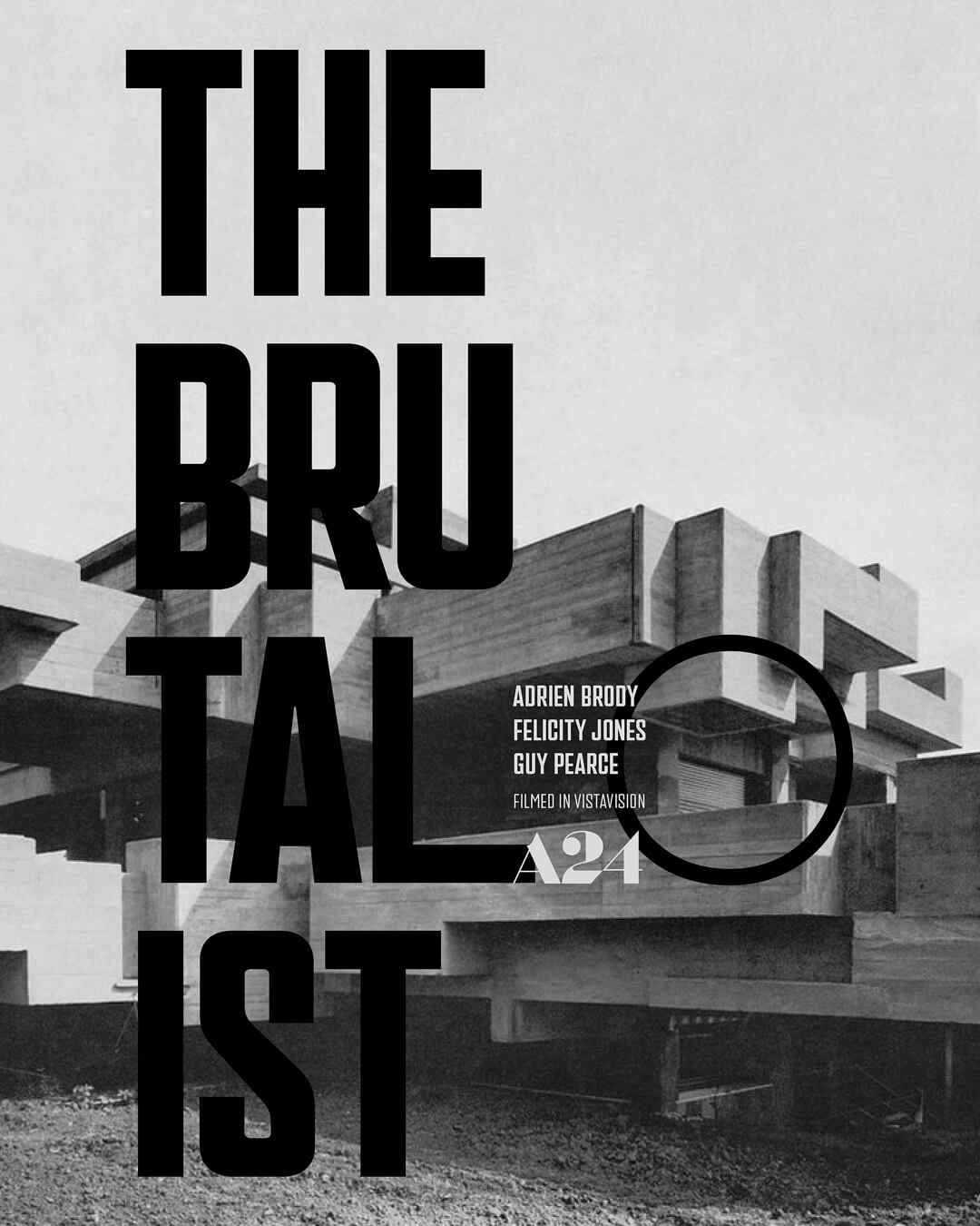
Nick: For The Brutalist poster, I wanted to capture the bold, raw aesthetic of Brutalist architecture and the film’s themes of ambition and displacement. A simple black-and-off-white palette reflects the stark beauty of concrete. The background features Villa Ronconci by Saverio Busiri Vici, highlighting heavy, geometric forms. I used a grid layout for a sense of order and strength, but introduced bold, fragmented typography to hint at László Tóth’s complex journey. Overlapping the text with the architecture emphasizes his deep connection to the world he builds. Every choice was made to convey the film’s intensity while keeping the design clean, striking, and true to the Brutalist spirit.

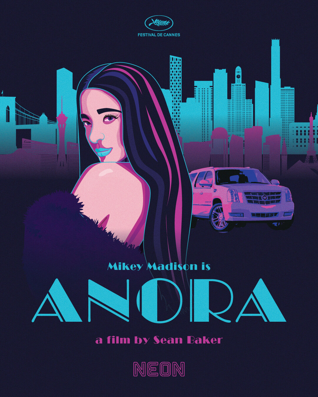
Derek: For my Anora poster redesign, I aimed to capture the film’s neon-soaked energy and hint at its darker undercurrents. Inspired by a Miami Vice aesthetic, I used vivid blues, purples, and pinks to convey a glamorous chaos. Anora—exuding confidence yet mystery—takes center stage, drawing viewers in while foreshadowing deeper turmoil. A stylized cityscape merges Las Vegas and New York, mirroring her whirlwind journey, and a sleek white Cadillac alludes to the film’s extravagant yet precarious lifestyle. The result? A vibrant, exhilarating facade that ultimately leads to something far more intense and unexpected.

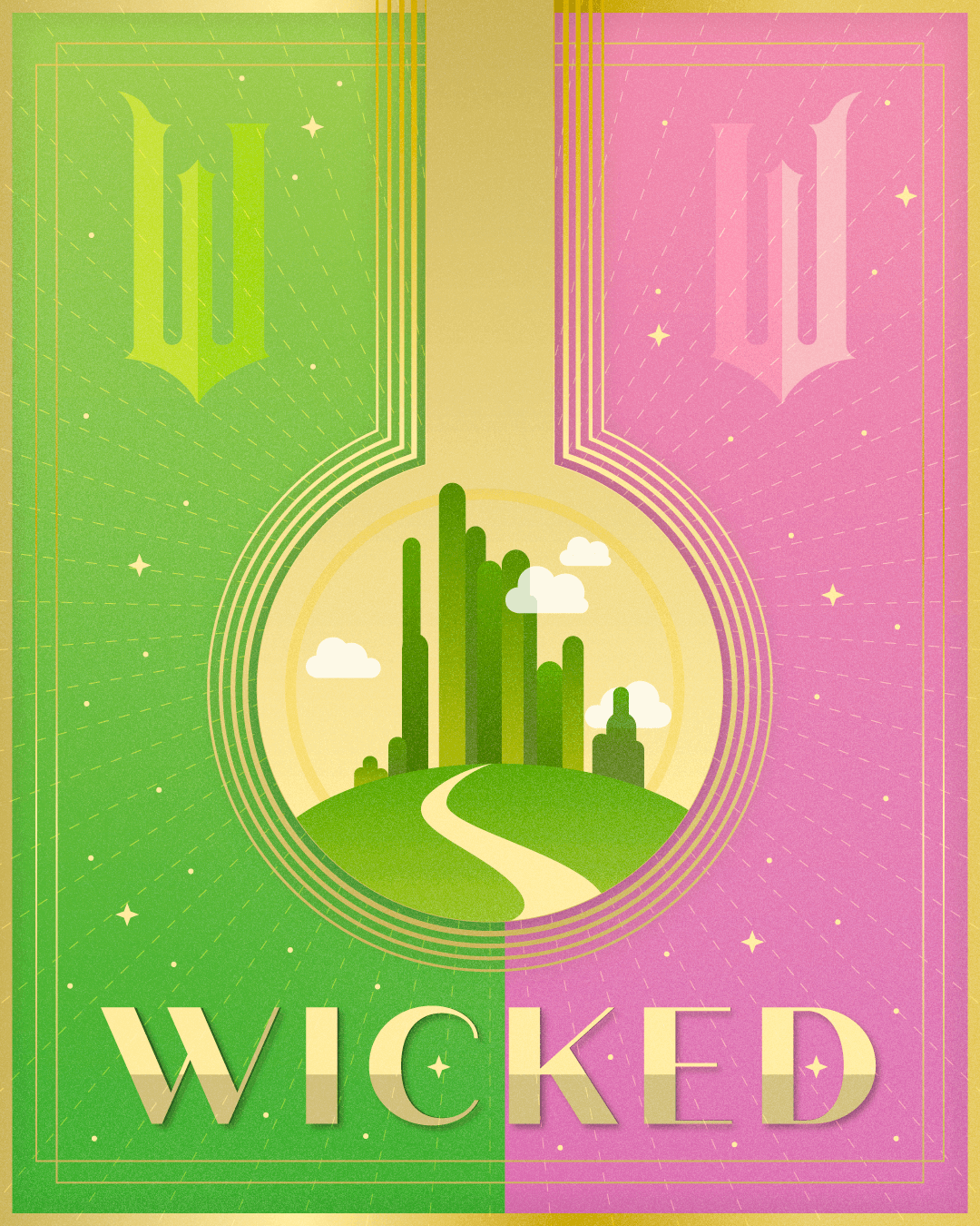
Julliette: I loved how Wicked used stark contrasts—pink and green, good and evil, hero and villain—to get viewers thinking. Glinda’s “princess of pink” vibe contrasts Elphaba’s rebellious green-skin persona. That contrast inspired my poster design, where I prominently featured those signature colors. I also placed the entrance to the Emerald City front and center, capturing both characters’ shared ambition. To challenge myself further, I experimented with an art deco aesthetic, echoing the symmetrical, balanced feel of the 2024 movie’s promotional style. It was my first time exploring art deco, and I enjoyed using it to highlight the visual dualities at play in Wicked.
Creative Interpretation: There’s No Single “Right” Answer
One of the most fascinating aspects of this kind of exercise is seeing how differently each designer approaches the same challenge. Creativity isn’t a formula—it’s a reflection of experience, influence, and personal perspective. Give ten designers the same brief, and you’ll get ten wildly different interpretations.
Creativity isn’t a formula—it’s a reflection of experience, influence, and personal perspective.
That’s the beauty of creative thinking. It reminds us that design isn’t about rules; it’s about exploration. A fresh perspective, a bold reinterpretation, or even a “mistake” can lead to something more dynamic and unexpected than the original concept. And in a world where audiences are bombarded with visual noise, originality is what stands out.
Why This Matters Beyond the Exercise
Designing movie posters is just the exercise—it’s the mindset shift that matters. The ability to break out of routine, take creative risks, and to push beyond what’s comfortable doesn’t just make for better designs; it makes for better creative problem-solving in branding, marketing, and beyond.
For brands, this means embracing the unexpected. It means being willing to experiment, to rethink how you visually communicate your story, and to trust that sometimes the best creative work comes from stepping outside of what feels obvious.
Reset. Reimagine. Create.
Cleansing the creative palette isn’t about throwing out everything you know—it’s about making space for something new. It’s about keeping creativity sharp, adaptive, and alive. Whether it’s redesigning a movie poster or rethinking a brand identity, the key to staying innovative is never settling into routine.
Because the best creative ideas? They rarely come from doing things the way they’ve always been done.
Nicholas Smith

